Thursday, 9 June 2011
More Dynamics
When doing the Dynamics for Ryan and Karl's name i thought that it would be best to have them slightly different from mine so that they did not all fall exactly the same. Ryans name has a slightly less bounce than mine where are Karl's has more movement.

Karen Block Dynamics
Now that the end scene has been completed, i have now started to experiment with Dymanics, which is another thing with in Maya which i have not tried before. I first had to create extra letters to make the team members names so that i could use the blocks as a way of making our names appear when the credits role. I thought of this when i was doing the torch animation as i thought this would be consistent with the animation.
As i had not done dynamics before i done some research online to see what tabs did what so that i would have a small knowledge on what to do. I first had to select all the blocks and turn them into active rigid bodies. The ground plane had to be a passive rigid body so that the plane would not react to the blocks and then i had to add a gravity field so that the blocks could fall.
Here is the very first test i ever done. You can see the floor plane in this which i never thought about until it was rendered. To solve this i made the floor plan higher so that the blocks would be higher on the screen and made the plane transparent.
Now that i had solved my first little problem i now had a new one. Although the blocks bounce quite nicely from the ground, they fall down rather slow, which looks unrealistic as the weight from the blocks would make the blocks fall down quicker.
I changed the height of some of the blocks so what they would not fall in a straight line as they looked to robotic and tidy. I wanted the blocks to fall down a little more randomly as if we were to do a real test, all the blocks would fall at different speed rate. Now that i had done that the letter 'N' had to much bounce and would now rotate backwards as it bounced. This actually gave me an idea to try and have the cube the wrong way so that when the cube would bounce it would rotate to the letter i need.
With the idea in mind tested, i liked how there was something more exciting happening to the blocks, but it also took a while for the movement to happen which i was not keen on. So i thought i would take that idea out, but i am glad i tried it out.
And here is the final one, as you can see i have made the speed of the blocks come down faster which looks more realistic and there is now only a small bounce in the blocks as there would not really be much movement as they are made from plastic.
As i had not done dynamics before i done some research online to see what tabs did what so that i would have a small knowledge on what to do. I first had to select all the blocks and turn them into active rigid bodies. The ground plane had to be a passive rigid body so that the plane would not react to the blocks and then i had to add a gravity field so that the blocks could fall.
Here is the very first test i ever done. You can see the floor plane in this which i never thought about until it was rendered. To solve this i made the floor plan higher so that the blocks would be higher on the screen and made the plane transparent.
Now that i had solved my first little problem i now had a new one. Although the blocks bounce quite nicely from the ground, they fall down rather slow, which looks unrealistic as the weight from the blocks would make the blocks fall down quicker.
I changed the height of some of the blocks so what they would not fall in a straight line as they looked to robotic and tidy. I wanted the blocks to fall down a little more randomly as if we were to do a real test, all the blocks would fall at different speed rate. Now that i had done that the letter 'N' had to much bounce and would now rotate backwards as it bounced. This actually gave me an idea to try and have the cube the wrong way so that when the cube would bounce it would rotate to the letter i need.
With the idea in mind tested, i liked how there was something more exciting happening to the blocks, but it also took a while for the movement to happen which i was not keen on. So i thought i would take that idea out, but i am glad i tried it out.
And here is the final one, as you can see i have made the speed of the blocks come down faster which looks more realistic and there is now only a small bounce in the blocks as there would not really be much movement as they are made from plastic.
Tuesday, 7 June 2011
Prop animation
Although it seems highly unlikely that i will be able to do any character animation, i can still do some prop. With me sorting out the lighting for this scene, i know feel that i can start the torch rolling across the floor.
With the first animation test you can just see the torch going from left to right, there is nothing all that exciting about the movement, it is all of the same speed which i think needs to change as it would not realistically move in that way.
For the second test i have now slowed down the movement near the end but i am now starting to think that it would look quite nice if the torch goes off the screen altogether.
This test now shows the torch going off the screen but the movement does not look right, it does not look as though it is curving round, it seems to just be moving to the right in a straight line.
Here you can see that the animation is slowly coming together but there is still changes to be made near the end of the movement.
The last test you can now see that i have sorted out the timing of the torch movement so that it is now slightly slower and the the torch light goes completely off screen which will now make it easier to start the end credits from.
With the first animation test you can just see the torch going from left to right, there is nothing all that exciting about the movement, it is all of the same speed which i think needs to change as it would not realistically move in that way.
For the second test i have now slowed down the movement near the end but i am now starting to think that it would look quite nice if the torch goes off the screen altogether.
This test now shows the torch going off the screen but the movement does not look right, it does not look as though it is curving round, it seems to just be moving to the right in a straight line.
Here you can see that the animation is slowly coming together but there is still changes to be made near the end of the movement.
The last test you can now see that i have sorted out the timing of the torch movement so that it is now slightly slower and the the torch light goes completely off screen which will now make it easier to start the end credits from.
Saturday, 4 June 2011
Prop Horse animation
I thought it would be nice to have the rocking horse slowly rocking back and forth in our animation as it would be windy outside in the storm, and it is highly likely that wind would come into the tree house. Having the rocking horse slowly moving would also seem slightly scary as i can imagine having creaky sound effects creating a slightly unsettling atmosphere.
I had to redo the rocking horse as when i first animated it, i forgot to move the pivot point to the bottom of the horse, so the movement looked rather messy. Once i had changed this, the rocking horse was fairly simple to do.
I have also done a crayon falling off the chest of draws as the wind would be able to effect many things in the treehouse.
I had to redo the rocking horse as when i first animated it, i forgot to move the pivot point to the bottom of the horse, so the movement looked rather messy. Once i had changed this, the rocking horse was fairly simple to do.
I have also done a crayon falling off the chest of draws as the wind would be able to effect many things in the treehouse.
Friday, 3 June 2011
Lighting
As i had now figured out the night lighting it was now time for me to try and get the light for the torch. I was finding this rather difficult for a while as a spot light is different to an area light.
 I could not seem to get the intensity of the light to be all that strong, although it was up to the highest on the bar, it still was not strong enough. I started playing around with other tabs to see if they made any difference but they were only making things worse. After a while i had to ask James and he told me that i could just write in the number i wanted for the intensity instead of pulling up the bar tab. It was something so easy and simple but as i was new to this i did not know. That is one thing i have already learned about lighting.
 The main problem i was having here was the light which is going behind the blocks. I did not understand how it was going through the object and going onto the wall. At first i thought that if i made the light beam thinner then hopefully that shall make a difference but it did not. I had to ask for James help again after a while and he asked me how i was rendering out as that would make a difference to the lighting. I tried different ways of rendering out the image but that was not making any difference. After a while i finally solved the problem, i used the penumbra tab down which made the light much softer and have a blurred edge as the light was far to sharp along the edges.
Lighting is rather interesting, i must say that it is fairly difficult and can be very time consuming when you do not understand the meanings of the strange tab names. It seemed to me that was my main issue, why do they not have simpler words for the tabs? I think i can happily say that i would not take on lighting as a profession, but i am interested to learn more. Lighting is very important to an animation and can send out many emotions. This has been a great little learning process for me and i am sure to do more in the future.

This is the end result to my lighting which i think has turned out really well, although i think i could change the light beam as i think the light is spreading out a little to far.
 I could not seem to get the intensity of the light to be all that strong, although it was up to the highest on the bar, it still was not strong enough. I started playing around with other tabs to see if they made any difference but they were only making things worse. After a while i had to ask James and he told me that i could just write in the number i wanted for the intensity instead of pulling up the bar tab. It was something so easy and simple but as i was new to this i did not know. That is one thing i have already learned about lighting.
 The main problem i was having here was the light which is going behind the blocks. I did not understand how it was going through the object and going onto the wall. At first i thought that if i made the light beam thinner then hopefully that shall make a difference but it did not. I had to ask for James help again after a while and he asked me how i was rendering out as that would make a difference to the lighting. I tried different ways of rendering out the image but that was not making any difference. After a while i finally solved the problem, i used the penumbra tab down which made the light much softer and have a blurred edge as the light was far to sharp along the edges.
Lighting is rather interesting, i must say that it is fairly difficult and can be very time consuming when you do not understand the meanings of the strange tab names. It seemed to me that was my main issue, why do they not have simpler words for the tabs? I think i can happily say that i would not take on lighting as a profession, but i am interested to learn more. Lighting is very important to an animation and can send out many emotions. This has been a great little learning process for me and i am sure to do more in the future.

This is the end result to my lighting which i think has turned out really well, although i think i could change the light beam as i think the light is spreading out a little to far.
Thursday, 2 June 2011
Finding Stength
Although there has been so many problems lately, that has not stopped me doing work. I have lately been working on some lighting which is something i have never done before. I thought it would be really nice if i could try and get the end shot done and then try and start with the credits.
The end shot is where Summer realises that is it only Pandy who is playing a trick on her and when she goes to grab and hug him, Pandy drops his torch.
 I done a series of tests to try and sort out the night time light. It was rather difficult to try and get right as we do not want the light to be to dark or we wont see any detail to our props, but we also have to remember that you wouldn't be able to see much in the dark.
 I tried putting a colour into the light but this was far to blue, although i think a hint of blue would look nice, a bit like the night time in Pixars UP. This was to bright and needed to be toned down.
 Here i have started to get the right kind of lighting but everything looks rather flat, there was something missing to make the objects stand out a little more.
 I thought that the shadows were turned on, but by default i found that you have to turn them on yourself and once i had, this was the result i got. This is much more realistic to what i had when i first experimented with lighting. I still think that it could be slightly darker, but i am definitely learning. I tend to find with lighting that you need to experiment with the tabs to see what they create then by knowing what to do straight away.
The end shot is where Summer realises that is it only Pandy who is playing a trick on her and when she goes to grab and hug him, Pandy drops his torch.
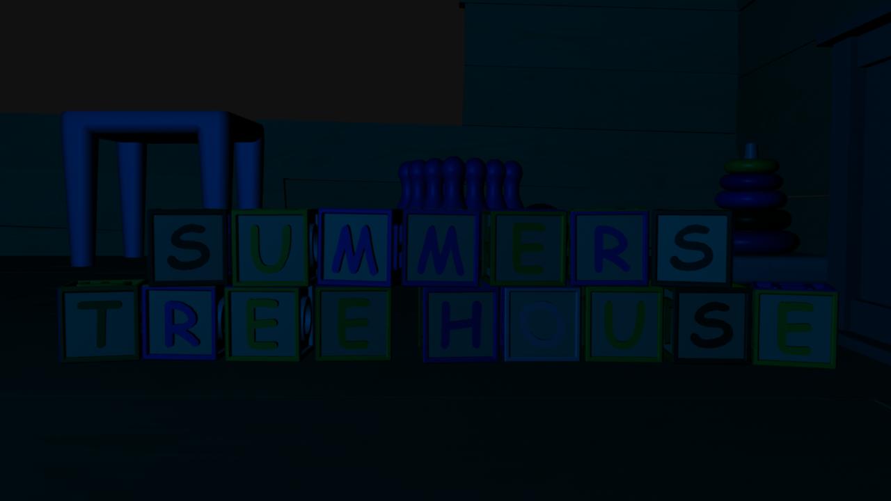 I done a series of tests to try and sort out the night time light. It was rather difficult to try and get right as we do not want the light to be to dark or we wont see any detail to our props, but we also have to remember that you wouldn't be able to see much in the dark.
 I tried putting a colour into the light but this was far to blue, although i think a hint of blue would look nice, a bit like the night time in Pixars UP. This was to bright and needed to be toned down.
 Here i have started to get the right kind of lighting but everything looks rather flat, there was something missing to make the objects stand out a little more.
 I thought that the shadows were turned on, but by default i found that you have to turn them on yourself and once i had, this was the result i got. This is much more realistic to what i had when i first experimented with lighting. I still think that it could be slightly darker, but i am definitely learning. I tend to find with lighting that you need to experiment with the tabs to see what they create then by knowing what to do straight away.
Wednesday, 1 June 2011
Rigging Help
After the character rigs fell through i tried asking around to see if anyone might be able to fix the problems that we have been having. As i know we are now near the end of the term everyone is now stressed with getting there own work done. I messaged Clym to see if he might be able to help. The next day he replied saying that he would see what he could do and within half an hour he had changed the smile blendshape control. The difference between Laura's smile to Clym's was massive, i was so happy with what Clym has managed to do and clarified that there was nothing wrong with my modelling as Laura said that there was to many vertexes to do the blendshapes properly, but Clym never found that to be a problem. Sadly Clym said that he would not be able to do anything more for us as he has so much work to get on with.
 Here is The blendshape which Laura done for us, this is the smile to its highest point. As you can see this looks incomplete, the cheeks do not move with the smile so her cheeks now look like they have dropped.
 And here is what Clym done for us within half an hour, as you can see, the smile has been completed to a much higher standard. The cheeks move with her mouth which makes a massive difference to the results.
This actually made me more upset knowing the standard that my characters could have been if only they were done properly. I felt so passionate about my characters and as it has come to a dead end i also feel the same.
 Here is The blendshape which Laura done for us, this is the smile to its highest point. As you can see this looks incomplete, the cheeks do not move with the smile so her cheeks now look like they have dropped.
 And here is what Clym done for us within half an hour, as you can see, the smile has been completed to a much higher standard. The cheeks move with her mouth which makes a massive difference to the results.
This actually made me more upset knowing the standard that my characters could have been if only they were done properly. I felt so passionate about my characters and as it has come to a dead end i also feel the same.
Subscribe to:
Posts (Atom)